Problem
The trial dropped people on the home page and left them to find their own way. Most clicked around for 10 to 20 minutes and left.
A small guided tour existed, buried behind a button, and the people who found it stayed longer and converted more often. We already knew guidance worked. We needed to make it the default.
Constraints
It was several projects released together: welcome screens, an agent, a home for trial content and a way to buy. Each depended on the others, and the timeline was short.
The company-wide AI push meant the product’s tools kept changing while we designed.
Decision
I designed three surfaces. Welcome screens set expectations, flag the sample data and ask a few questions. The agent, really several agents in a trench coat, uses what we know about the prospect to tailor the trial to their industry and suggests a next step when someone lingers. The trial hub holds everything in a drawer that slides down on any page.
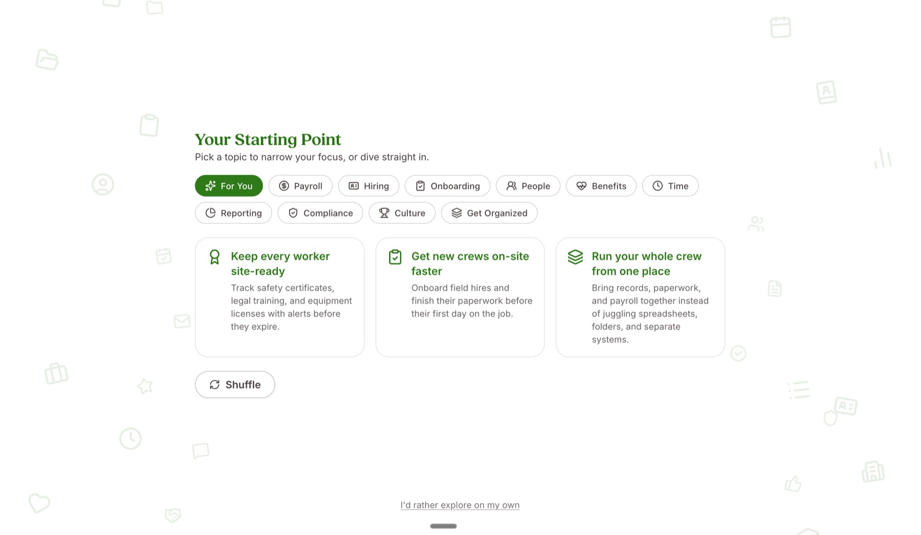
Three calls came out of testing. I dropped a chatbot that followed people around, because they had chatbot fatigue. I moved the hub from its own page into a drawer in the trial’s black, so people could tell the trial from the product. And I rewrote the agent’s suggestions around outcomes, instead of repeating people’s pain points back to them.
Outcome
It didn’t ship while I was there. The design was tested and handed off, with release planned for shortly after my role ended, so I can’t show conversion numbers.
Reflection
The brief felt prescribed: put AI in the trial. Each round of testing taught me more about how people feel about AI and what a trial is for. A trial shows how the product looks and feels, and the best thing I could do was make it excellent at that one job.